Devpost
Participate in our public hackathons
Devpost for Teams
Access your company's private hackathons
Grow your developer ecosystem and promote your platform
Drive innovation, collaboration, and retention within your organization
By use case
Blog
Insights into hackathon planning and participation
Customer stories
Inspiration from peers and other industry leaders
Planning guides
Best practices for planning online and in-person hackathons
Webinars & events
Upcoming events and on-demand recordings
Help desk
Common questions and support documentation
This project aims at helping the developers at one of the most important parts of being a developer, that is staying updated, it is a collection of many news that developers need.
counting population
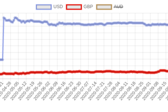
The Forex and Crypto market is the fundamental financial markets we have in our Economy.I made a simple Currency Chart Visualizer that will help you keep tabs on movement on price action.
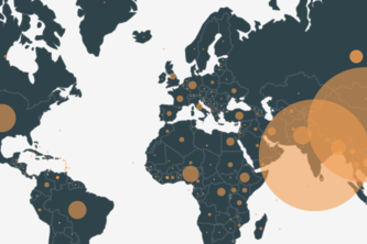
Want to know what's going on around the world.You're at the right place.
i have used github api and takeout user name and his/her photo.
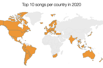
Here I showcase a map chart made with help of the Anychart.js library. When the user hovers over any of the countries they will be able to see a list of the top 10 songs that were listened in 2020.
Finding the right remote jobs in the tech world is the most tiring process and requires a lot of effort in building the network. This visualizer matches you with the right remote job..
Collection of various champion information and comparing the amount of words that their skill descriptions contain to the most recently released champion, Akshan.
A simple tool to understand ratings received by shows over seasons.
Visualizing the data in form of geocharts
Take a break, relax and immerse yourself in the 1MM cells at one place!!!
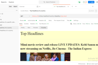
Locates articles and breaking news headlines from news sources and blogs across the web. API used: https://newsapi.org/ (NEWS API).I have used the News API.
Visualization of tasks using an interactive doughnut chart!
The dClimate API Visualizer allows you to visualize all sorts of weather data from the dClimate API.
Using Postman to visualize and represent the request responses
Most popular web framework as per Stackoverflow Survey2020
We live for creativity and passion
This is a visualizer created using Postman to view all the superheroes across various comic universes under one roof.
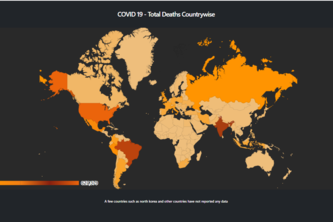
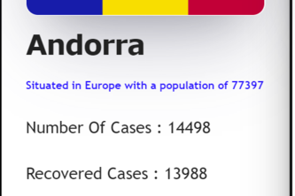
Using Postman's Visualizer feature displayed country wise Covid stats in the form of cards for easier grasping. Each card contains the the country name, flag , number of cases ,recovered ,deaths ..etc
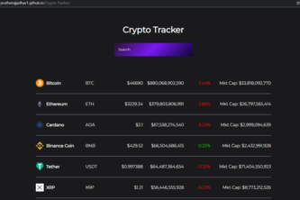
So this project is made with React JS and by using CoinGecko market API the data is fetched to the site. This helps to keep track of the crypto market.
GeoJSON response is visualized as an interactive map built with a base map of choice and spatial data points grouped into layers. It supports fuzzy search on values of non-spatial attributes.
Api Just What The Doctor Ordered
Visualizing data from API response in a good readable manner with the help of postman
1 – 24 of 32